
Screen It! - Demo Reviews
10 of the best demoscene releases of 2009 reviewed
Reviews written by Navis of Andromeda Software Development and KeyJ of Kakiarts
Guest starring: Maq of Floppy & Hardcoders
Prologue written by Magic of Nah-Kolor

Prologue
This is already the 3rd installment of the Screen It! series. As in the two previous issues of Hugi we bring you reviews of 10 great demoscene releases. Each release is reviewed by two coders to have two different point of views to bring some contrast, which hopefully makes the reviews more enjoyable to read. Navis returned for this issue to air his thoughts while KeyJ is still among us from the very beginning. In this 3rd installment we ran into a slight problem. Navis' demo 'Rupture' could not be excluded as it is definitely among the top 10 releases of 2009. In our opionion it would not be a good idea for Navis to review his own demo so as a special guest Maq (Breakpoint 2009 winner) did the Rupture review instead. I (Magic) did the first selection of the 10 productions for this Screen It! And after some e-mail exchanges with KeyJ some minor changes were made. The 10 productions reviewed are: Assembly 2009 Invitation, Crush, Elevated, Etch-A-Sketch, Frameranger, Puls, Quantum, Rudebox, The Golden Path and Rupture. Have a nice time reading the reviews. (Note: Click on the name of a demo for a link to Pouet.net.)
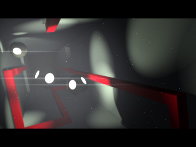 Assembly 2009 Invitation by Andromeda & Excess & Nooon
Navis:
Demoscene names don't get bigger than that. The demo starts great with a simple parallax vertical scrolling, then moves on with some coder pornography involving clever use of shadows, a global illumination effect and, at the end, a particle effect that will leave you scratching your head. Music is top notch too. Invitations don't get much better than that.
Graphics: 5/6, Music: 5/6, Effects: 6/6, Concept: 6/6, Overall: 5/6
KeyJ:
Invitation demos are often lame and uninspired. This one is not. It seems to me like a collection of leftover effects that did not make it into 'Stargazer' – and I mean this in an absolutely positive way. There's a beautifully drawn old-school intro, cubes with nice shadows and fake radiosity, an Assembly logo that assembles itself (awesome idea, by the way), a light shaft, image puzzle cubes, another light shaft (this time with shadows) and finally a cool particle effect. Finally, we have another amazing soundtrack by Gloom. Almost a perfect demo, except that it's too short :)
Graphics: 4/6, Music: 5/6, Effects: 5/6, Concept: 2/6, Overall: 4/6
Navis:
Crush is a rather tiresome demo that recycles the same old effects: objects, usually cubes or spheres, rotate in the center of the screen, then crash into each other. In between we get a glimpse of some ridiculous pregnant robots that only viewers under the age of 14 would find interesting or cool. Music is uninspired and cliche, with no real connection to the visuals. The whole thing drags on until the end - however, the very last scene with the particle tree is amazing in its simplicity. Shame that the rest of the demo isn't.
Graphics: 3/6, Music: 2/6, Effects: 3/6, Concept: 1/6, Overall: 2/6
KeyJ:
Anadune has always been one of my 'coup de cśur' groups: They consistently delivered pleasant, clean, beautiful demos with nice music which I always enjoyed watching, but they never received the fame they deserved. They usually ended up somewhere around the 10th place in compos at major parties – until this year: They finally managed to win the demo compo at Breakpoint! I'm really happy for them, but I also have to say that the main reason for this is the lack of competition. Don't get me wrong, I like this demo. It has all the aforementioned qualities of Anadune demos: Pleasant, clean, beautiful, (almost) nice music – but yet, it doesn't quite fit into the list of previous year's Breakpoint winners. All scenes in this demo look fine, but most of them are just repetitions of the same two topics, which is 'flyby of glossy object' and 'collision of a shitload of cubes'. However, there are two scenes which are perfect in every aspect and thus make this demo a must-see: The particle/fluid simulations are simply gorgeous.
Graphics: 3/6, Music: 3/6, Effects: 5/6, Concept: 2/6, Overall: 3/6
Navis:
The magicians of shaders strike back with a 4k made in heaven. These guys are very clever: they managed to find and squeeze in a simple effect (the laser beams) on top of their already superb landscape routine. This lifts the production from merely a fly-over to a proper 'demo': narrative, progression, connection with the music, they are all there. A milestone!
Graphics: 6/6, Music: 6/6, Effects: 6/6, Concept: 6/6, Overall: 6/6
KeyJ:
A beautiful photo-realistic image of a snow landscape, that's what the 4k executable graphics entry 'Ixaleno' delivered in 2008. This was already a major jaw-dropper, but exactly one year later, IQ teamed up with the kings of the 4k intros and set this picture in motion: What we saw at the 4k compo at Breakpoint 2009 was truly breathtaking. 'Elevated' is not just 'realtime Ixaleno', it's much more: (Partial) high-dynamic range rendering and motion blur make the images even more stunning than they already are. Finally, there's arguably the best soundtrack ever heard in a 4k intro. Can it get any better than this?
Graphics: 5/6, Music: 6/6, Effects: 6/6, Concept: 3/6, Overall: 6/6
Navis:
First let me say that Etch-a-sketch has a very catchy tune and some good coder work, as it incorporates a nifty physics engine. But I'm afraid as a demo it left me cold. For a start it is very short: it is less than 3 minutes, and nothing much is happening. I guess it follows from the other (also short, but much better) demo from Candela "Fair play to the queen". In Etch-a-sketch we see the very likable robot fly through space and then crash into a wall. The end. It feels more of a show off of the physics engine routine (nothing wrong with that, of-course) than a coherent demo.
Graphics: 3/6, Music: 4/6, Effects: 3/6, Concept: 2/6, Overall: 3/6
KeyJ:
With the demo 'Fair play to the queen', newcomer group Candela had an instant hit in 2005. After a few years in which they released only two smaller demos, they came back to the main stage this year with 'Etch-A-Sketch'. This demo is essentially 'Fair play to the queen part 2', with all its benefits and shortcomings. This means that it is a good demo with decent graphics and fitting music, but on the other hand, it's just 'more of the same': It has the same style and mood as its predecessor, the graphics look almost the same and I'd bet that the robot model is actually the same. OK, this might be some kind of trademark for the group, but nevertheless I'd really love to see something new and fresh from them again.
Graphics: 2/6, Music: 3/6, Effects: 3/6, Concept: 3/6, Overall: 2/6
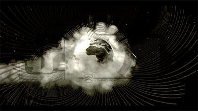 Frameranger by Fairlight & CNCD & Orange
Navis:
The production values of this demo are in stratospheric levels: it looks as though Fairlight and co. fine-tuned every single detail of this amazing ride, then went back to it again and again (probably for months) until they had a perfect setup of modelling, shading and camerawork. The timing is impeccable: it gives you enough time at the beginning to settle for the bombastic journey, before calming down again at the end. A technical and artistic landmark.
Graphics: 6/6, Music: 4/6, Effects: 6/6, Concept: 4/6, Overall: 6/6
KeyJ:
For years, the Fairlight/CNCD/Orange triumvirate tried to win the demo compo at Assembly, but they didn't succeed: In 2006, 'Track One' was smashed to pieces by TBL's 'Starstruck' and in 2007, 'Media Error' didn't stand a chance against ASD's 'Lifeforce'. In 2009, however, they finally succeeded at their quest. The ingredients are the usual ones: the newest and greatest in rendering technology, top graphics, superb music and a very distinct style. Unfortunately, 'Frameranger' still isn't free of the problems of its predecessors: It still needs hardware from at least two years in the future to run smoothly and even though it's doubtlessly the most consistent Fairlight Assembly demo to date, it's not quite there yet. After the intro part (which is a tiny bit too long, I think), there's a well-choreographed 'Transformers'-style robot fight with insanely great music, but after that, it really goes downhill: The last three minutes of the demo are a more-or-less pointless effects show with repetitive oldschool music that gets boring after a couple of seconds. The effects are well-made coder porn and very cool from a technical perspective, but still they don't look impressive enough to really let my jaw drop. So I can just say that Fairlight/CNCD/Orange are definitely moving into the right direction, but they didn't fully conquer my heart yet.
Graphics: 5/6, Music: 5/6, Effects: 6/6, Concept: 4/6, Overall: 5/6
Navis:
Would you believe me if I told you, ten years ago, that one day a 256byte intro like this would exist? No. Neither would I. What probably happened here is that Rrrola ran a random '256 bytes intro' generator for years and then Puls came out. After about a ten billion trial and errors. As such, it is the best 256bytes ever written, past present or future.
Graphics: 6/6, Music: N/A, Effects: 6/6, Concept: 6/6, Overall: 6/6
KeyJ:
256 Bytes aren't much. Even for a 4k coder, the world of 256 byte intros seems to be weird and alien. Anyhow, it's impressive what can be done in this little space. One of the most proficient 256-byte coders of the last few years is Rrola. I think it's safe to say that he delivered his masterpiece this year: 'Puls' is an impressive raymarching effect that would make an excellent 1k intro – except that it's just quarter the size.
Graphics: 3/6, Music: N/A, Effects: 6/6, Concept: 5/6, Overall: 5/6
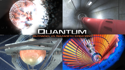 Quantum by Outracks & Nazareth Creations
Navis:
I can't help but think that this demo feels slightly unpolished in terms of connection between the scenes. Nevertheless, this is a great old-schooler, where integration and story are, more or less, irrelevant. what we have here is some strong individual scenes with plenty of shader-work and a catchy tune, all looking very impressive on the big screen, as it is the case with demos from Outracks. On second thought, there is probably enough "story" (it is all about the large hadron collider, isn't it?) to satisfy those with a look for some sort of narrative arc, so it is thumbs up from me too!
Graphics: 4/6, Music: 4/6, Effects: 4/6, Concept: 3/6, Overall: 3/6
KeyJ:
I love Outracks demos. They always have a particular, hard to describe style in their visuals and music that appeals to me. 'Quantum' follows exactly the traditional Outracks route and that's why I love it. A good part of this is due to the amazing soundtrack from Irvin – strictly speaking, the music doesn't fit the demo in some places, but for some reason (which might be me being an Outracks fanboy :)) it works nevertheless. The first part of the demo is heavily inspired by the LHC; in the middle part, we even see something like a particle collision. Other than that, the effects are relatively few – this demo clearly lives from its clean visuals and music, not from the effects. But still, there's one noteworthy effect in there which I've not seen before: An infinite zoom into a delicate arrangement of cogwheels inside of cogwheels, like in a clockwork. My only real complaint about this demo is that is seems to be unfinished: It ends quite abruptly ...
Graphics: 4/6, Music: 6/6, Effects: 4/6, Concept: 4/6, Overall: 4/6
Navis:
This 4k succeeds in creating a very strange, alien atmosphere, with its exotic graphics and music. Probably because, rather than using the triangle-based 3D graphics pipeline to produce their images, they do everything with ray-casting through complex noise functions. It works very well, it is probably the best demo of its kind (save for the static 4k procedural wonders from rgba). I'd prefer it to be a tad longer though.
Graphics: 4/6, Music: 3/6, Effects: 5/6, Concept: 4/6, Overall: 4/6
KeyJ:
2009 has been the year of raymarching 4k intros. Be it 'Sult' or 'Myon Baryon', the perfectly clean appearance of this rendering style has been a common sight lately. Alcatraz' 'Rudebox', however, dares to be different. As the name already suggests, this intro doesn't only feature smooth, sterile surfaces – in fact, most of it is rough and that's what makes 'Rudebox' particularly interesting. There are numerous good scenes in this intro and the bike chase scene at the end of the demo is simply brilliant. The sound is impressive, too: Done by the makers of 4klang, one of the two best-sounding 4k synthesizers in existence, it demonstrates that today's 4k soundtracks are almost on par with what we usually hear in 64k intros (except 'Panic Room' maybe :).
Graphics: 4/6, Music: 4/6, Effects: 5/6, Concept: 5/6, Overall: 5/6
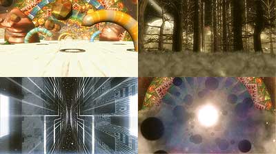 The Golden Path by United Force & Digital Dynamite
Navis:
The golden path is a special little demo: it embarks on a long, mesmerizing journey through time and space, that reminds of the 'its full of stars' section in 2001. Visuals and music are relentless, enough to satisfy even those with the attention span of a flea.
However, it scores low on originality points, as it is influenced heavily by another video (the sound of violence by Cassius) - in some cases the visuals are almost identical. Nevertheless, it is a unique and enjoyable experience.
Graphics: 4/6, Music: 5/6, Effects: 4/6, Concept: 3/6, Overall: 4/6
KeyJ:
This demo is one of the frequent cases where a good idea is turned into a bad demo by means of bad execution. While the concept of flying through abstract worlds without turning or looking back might be nice, this demo is not. The mediocre music and in some parts childish graphics totally spoil the experience. Furthermore, there is object popping all over the place and the textures are rather low-res, making it look like an old-school prod in a few ways (which might be deliberate, of course). As an Amiga AGA demo, this would have been OK, but as a PC demo, it's not. The only scene worth watching is the forest scene in the last third of the demo.
But then again, this is all my personal opinion. It might very well be that I'm just missing the point and don't understand this masterpiece yet, so don't be fooled by my criticism and watch this demo anyway :)
Graphics: 1/6, Music: 2/6, Effects: 1/6, Concept: 5/6, Overall: 2/6
KeyJ:
Like all major ASD demos, 'Rupture' takes you to a seven-minute trip of beautiful and confusing imagery and makes you say 'WTF?' at the end. The demo is very similar to 'debris', but also completely different. If you're thinking now that I'm talking in mysteries, then you're probably right, but that's simply because 'Rupture' is a mystery in itself. I've never before seen a demo that is completely consistent not only in style, design and even storytelling, but nevertheless doesn't seem logical at all. So the best thing to do is stop trying to make sense of it and simply enjoy the trip: Accompanied by another great soundtrack by Amusic, the viewer is taken through a land made of wireframes in blueish hues which is falling apart, possibly due to the very presence of the viewer itself. The journey takes place by motorbike, truck, train, boat and helicopter and passes cities, alien seas and train tracks in space. Oh, did I mention that nothing of that seems to make any sense? But it doesn't need to, because this enigmatic style is what makes this demo the masterpiece it is.
Graphics: 4/6, Music: 4/6, Effects: 3/6, Concept: 6/6, Overall: 4/6
Maq:
I saw Rupture for the first time at Breakpoint 2009. My reaction was close to 'oh god, thank you it didn't take part in this year demo competition at breakpoint'. But honestly, it would have been a pleasure to lose to such a demo... Anyway, for me, the most astonishing part of Rupture is the music which simply makes the demo. On the other hand, the storyboard, smoothness of animation, the nice wire frame shader, some simple-but-nice-looking physics hacks are great, too. Everything gathered together by Navis is simply beautiful. I cannot say it is any milestone for the demoscene (as Debris or Stargazer are for me). But this is a kind of demo that I will show to ordinary people to show how strong the scene is. I wouldn't regret to learn something about design from Rupture too. Navis, how the hell do you find all of your ideas, really?
Graphics: 3/6, Music: 6/6, Effects: 3/6, Concept: 6/6, Overall: 6/6